Search This Blog (A.K.A. "I Dote On...")
Both
Benton Park and
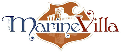
Marine Villa have recently adopted new banners/logos. The two neighborhoods stare across Cherokee Street at one another--and now their rebranding efforts go head to head as well.
Which do you prefer: Benton Park's clean, classic banner utilizing the colors of the St. Louis flag or Marine Villa's stylized crest emblazoned with the landmark Lemp Brewery?
OR
You decide.
Dotage St. Louis -- Blogging the St. Louis Built Environment Since 2008
Topics: Historic Preservation, Politics and Government, Development, Architecture, Urban Planning, Urban Design, Local Business, Crime and Safety, Neighborhoods, and Anything Else Relating to Making St. Louis a Better City!


16 comments:
I like the Marine Villa logo; Mainly the nod to the Falstaff logo
benton park
I would think that a street that borders two neighborhoods should have banners neutral to each neighborhood or incorporate both. One neighborhood should not get to "claim" the street and it seems quite silly to have dueling banners on each side of one street. Please tell me that they did not actually do that.
Neither MV nor BP have banners on BP, so no worries there ;)
err I mean banners on Cherokee :)
Paul-
Sorry, my post has forced an antagonistic tone onto these two rather peace-loving neighborhoods. No, Cherokee will not have dueling banners, and neither neighborhood will claim the street.
I am not even sure if the Marine Villa banners will make it to the light poles. Mr. McKee, what say you?
Antique Row has their own banners (though none are currently on display). All of the street lights are on the MV side of Cherokee, but I don't think MV will pursue banners on Cherokee because Antique Row has banners that occupy those posts.
BP has placed their banners on every other outer street (ie Jefferson, Gravois, etc) and I don't think it looks bad or silly. Just my personal thoughts. I think BP has done a great job defining their "turf" and helping people identify the boundaries of BP that may not otherwise be familiar with the technical boundaries of the 'hood.
Why does it have to be 'battle'!
Cowgirl-
See my previous comment. I have, apparently unduly, caused tension between these two neighborhoods. The purpose of the post is merely to see which banner the reader likes better.
:D
It's lighthearted! The important thing is St. Louis neighborhoods are actively working to develop the image that is projected to outsiders. I love this stuff!
I dig the Marine Villa. :) But I will point one thing out... the BP one is the banner design, not the actual logo. And the MV one is actually the logo, not a banner design. So it's not exactly comparing apples to apples. Either way, I love the fact that both neighborhoods are stepping up to the plate and putting forth solid fresh images. It's a good sign for the city.
What great two collective neighborhoods they are, too.
I think both did a great job on their respective logos/banners.
It's great that there's interest in Marine Villa and Benton Park and how the neighborhoods are working on brand and identity. Very cool.
I wish Marine Villa luck on its banner project. It's a ton a work, at least it was for me. I live in Benton Park and was a member of the Benton Park Neighborhood Association's Marketing Committee.
We opted to stay off Cherokee Street and DeMenil Place with Benton Park banners for three reasons.
* The project is supposed to be a positive one, and the BPNA wanted to avoid potentially irritating other groups.
* The brand identity water is already kind of muddy on Cherokee and DeMenil. Around those two streets in this area, there are: three neighborhoods (Marine Villa, Benton Park and Soulard); three city historic districts (Benton Park, Cherokee-Lemp Brewery and Soulard); a business group (Cherokee Antique Row); and a special tax district. Not to mention the overlapping Benton Park National Historic District.
* The Benton Park neighborhood ends on the north side of Cherokee Street. The light-poles (that we would have installed banners on) are on the south side of Cherokee, which is in Marine Villa.
The decision was a no-brainer. We opted to visually create a southern Benton Park border by installing banners on the 3300 block of S. 18th, Lemp, Salena, Wisconsin, Illinois, Missouri, Indiana and Jefferson.
By the way, if you're interested, the BPNA has received some nice attention from area news media for the banner project. Check out http://bentonparkstl.blogspot.com/ for links to press clips and video.
I think the Benton Park design is better suited for a banner - it's clean, simple and bright. It will be more visible from a distance, and will look better as you see a string of them lining the street. That said, the Marine Villa design is really cool. The use of the Falstaff crest is awesome.
Benton Park, hands down.
It's not a battle between the neighborhoods, folks, it's just a simple question as to which design is better.
Very exciting that our historic neighborhoods are taking on these branding campaigns. I'm from Benton Park and totally dig my Marine Villa neighbors to the south. That being said though, I've gotta stand by my 'hood... I love our banners!
Post a Comment