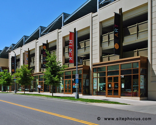
I love how the storefront bays project out from the garage structure. All of the design elements combine to both declare this is a garage and, at the same time, minimize the potential ugliness. The vertical banners draw attention to the roof (and to themselves) rather than the parking deck. The angled roof lends a visual interest to the structure and, again, just doesn't scream "garage"--which is a good thing.
This photograph is courtesy of SitePhocus--"the on-line image library of the built environment".
Sounds like a great resource. No St. Louis photographs there yet, though.


6 comments:
That's really nice. I like the flourishes along the roofline (sorry, I'm not an architectural expert, so I don't know the proper terminology!)
I'm actually not sure what to call them either--cantilevers?
Still a garage my friend
So there's no such thing as a nice garage?
We hope to get to St. Louis to get photos soon for sitephocus! Thanks for stumbling onto our photography!
As for the perfect garage, that would be one that's concealed as much as possible, either wrapped completely by a structure or underground.
In this situation, at least it's not a surface lot, though it would have been closer to perfection had they included residential above the retail as a liner. Could have been single units above as a live/ work or townhome feel.
Chris
Post a Comment